BLOG
The white of 2026. Why Cloud Dancer is the code of interior design
There is always a certain buzz around the Pantone Color of the Year. Sometimes it’s a nostalgic pastel, other times a reassuring beige that recalls the digital childhood of millennials; but 2026 has taken a different direction: a visual reset. Pantone has declared Cloud Dancer — a “airy, balanced, silent” white — as the shade that will lead the new year, not a technical white, not a hospital white, but a white that promises calm, clarity, and a new beginning in space design.
The public reaction? Mixed, of course. Some have cried out at yet another provocation (“a color… non-color?”), some have accused Pantone of being out of touch, while others have seen the choice as an excess of neutrality in a complex historical moment. But this ambiguity, in the world of interior design, opens opportunities rather than problems; it is a design material, a surface, a base, a structure.
Pantone defines it as a “structural” color, capable of highlighting every other shade, and this, in interiors, is exactly what is needed when you want to build atmospheres and not just decorate a room; it is the color that does not compete, but amplifies; supports; does not overload, but makes readable. It is no coincidence that Pantone speaks of transformation, of the need to reimagine our place in the world, interior design absorbs these cultural changes: when everything outside is too much, interiors seek order, light, simplicity.

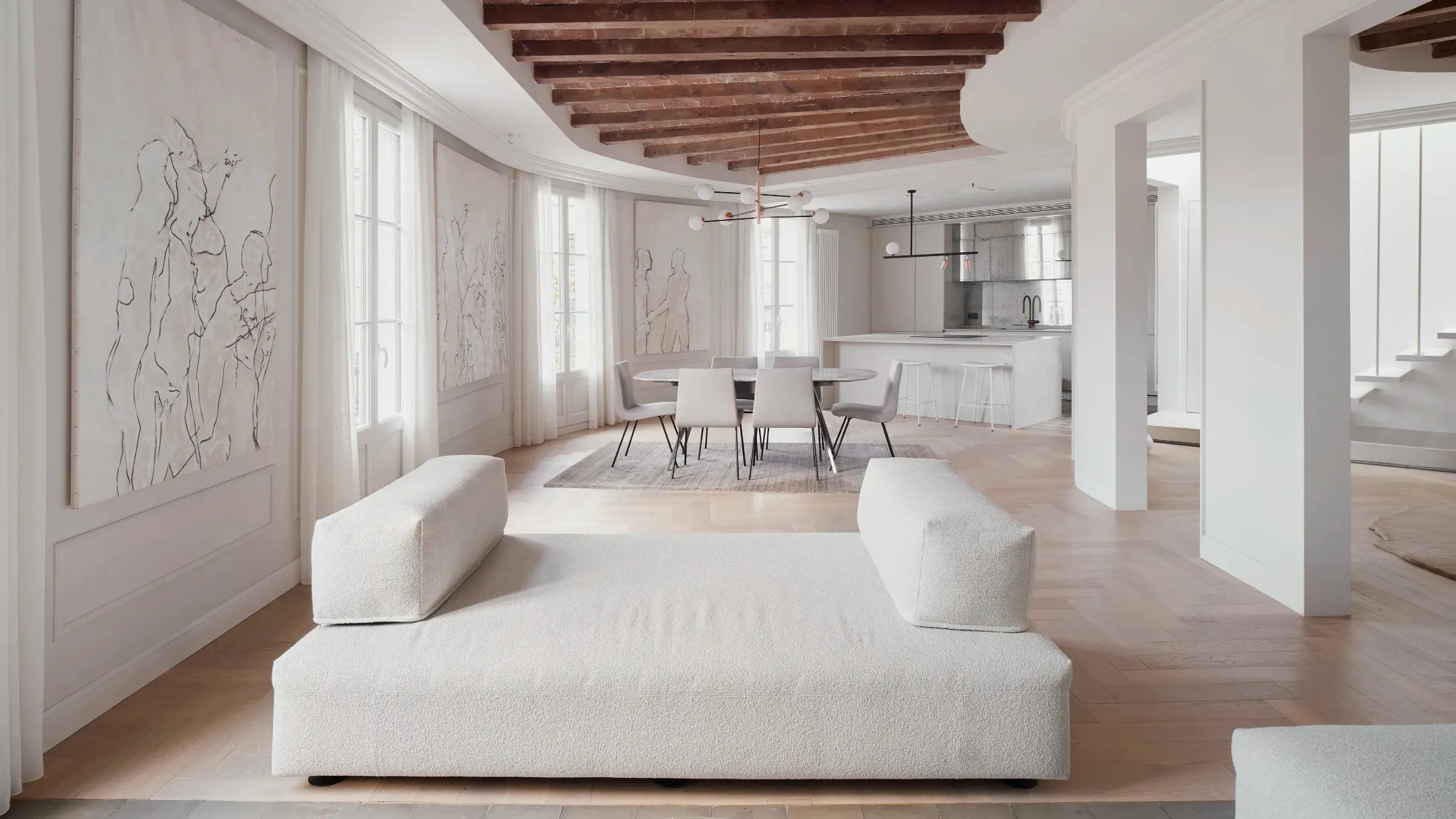
How to really use it in spaces
The trick is to let it do the work it was designed for: to offer clarity and breathing space, not to erase personality. For this reason, it is important to pair it with materials that tell its function, without letting it float in the void; so go ahead with natural wood, matte stone, textured ceramics, raw fabrics, frosted glass, non-glossy metals. All elements that compensate for the purity of white with grain, warmth, depth.
When treated this way, Cloud Dancer stops being “just white” and becomes an environment, a container that welcomes furniture, curved shapes, soft surfaces, organic objects. The home no longer appears minimalist by subtraction, but by intention.
Where It Works Best
In kitchens, because it amplifies light and makes the architecture visually cleaner. In bathrooms, where it immediately builds an urban spa feel, in living rooms, where it can become a neutral background for darker woods, artisanal ceramics, or design pieces with soft shapes.
And then there is the most pragmatic advantage: Cloud Dancer is already in homes: white walls, white lamps, white curtains, white ceramics, sinks, bathtubs, even small everyday objects; it is an invitation not to buy compulsively, but to rethink what already exists — a surprisingly rare form of sustainability in the world of color.
The message behind the white
It is not a color chosen to amaze, it is a color chosen to breathe after years of visual saturation — from social media to decor palettes — Pantone proposes a scheduled pause. A mental room before a physical one and a surface from which to start again.
Cloud Dancer is not the celebration of white, but the celebration of space, light, and silence. And it is there that, in 2026, interior design seems to want to return: to the possibility of creating environments that do not overwhelm.
Photo credits: Pantone / AD