BLOG
The allure of monochromatic decor: which colors to choose. A brief guide
In interior design, color choice plays a fundamental role in defining the atmosphere and style of a home. Among the various color options, the monochromatic approach stands out for its ability to create elegant, harmonious, and visually coherent environments; but what exactly does it mean to adopt a monochromatic color scheme for decor and how can we apply it in our living spaces?
What is a monochromatic color scheme?
It is based on the use of a single color hue expressed in different shades, tones, and intensities. This approach involves using various levels of saturation and brightness to create depth and visual interest within a space; for example, in a room dominated by blue, you can combine shades ranging from pale blue to navy, integrating elements like walls, furnishings, and accessories in these different hues.
Advantages of a monochromatic approach in decor
- Visual coherence: using a single color in various shades ensures a uniform and harmonious appearance, avoiding excessive contrasts that can be disorienting.
- Simplicity and elegance: monochromy gives spaces a clean and sophisticated aesthetic, often associated with modern and minimalist designs.
- Decorative flexibility: this scheme facilitates matching furniture elements, reducing the risk of stylistic and chromatic inconsistencies.
- Emphasis on textures and shapes: with the reduction of color variety, attention shifts to materials, textures, and shapes of furnishings, adding depth and interest to the environment.
Strategies for implementing a monochromatic scheme
To achieve a harmonious effect without risking monotony, it is essential to balance colors and materials carefully. The first step is the selection of the base color, which should reflect the desired personality and atmosphere for the space: blue can evoke calm and serenity, while green recalls nature and freshness. Once the main color is chosen, it is useful to vary the shades within the same color range; combining light and dark tones helps create a sense of depth and dynamism.
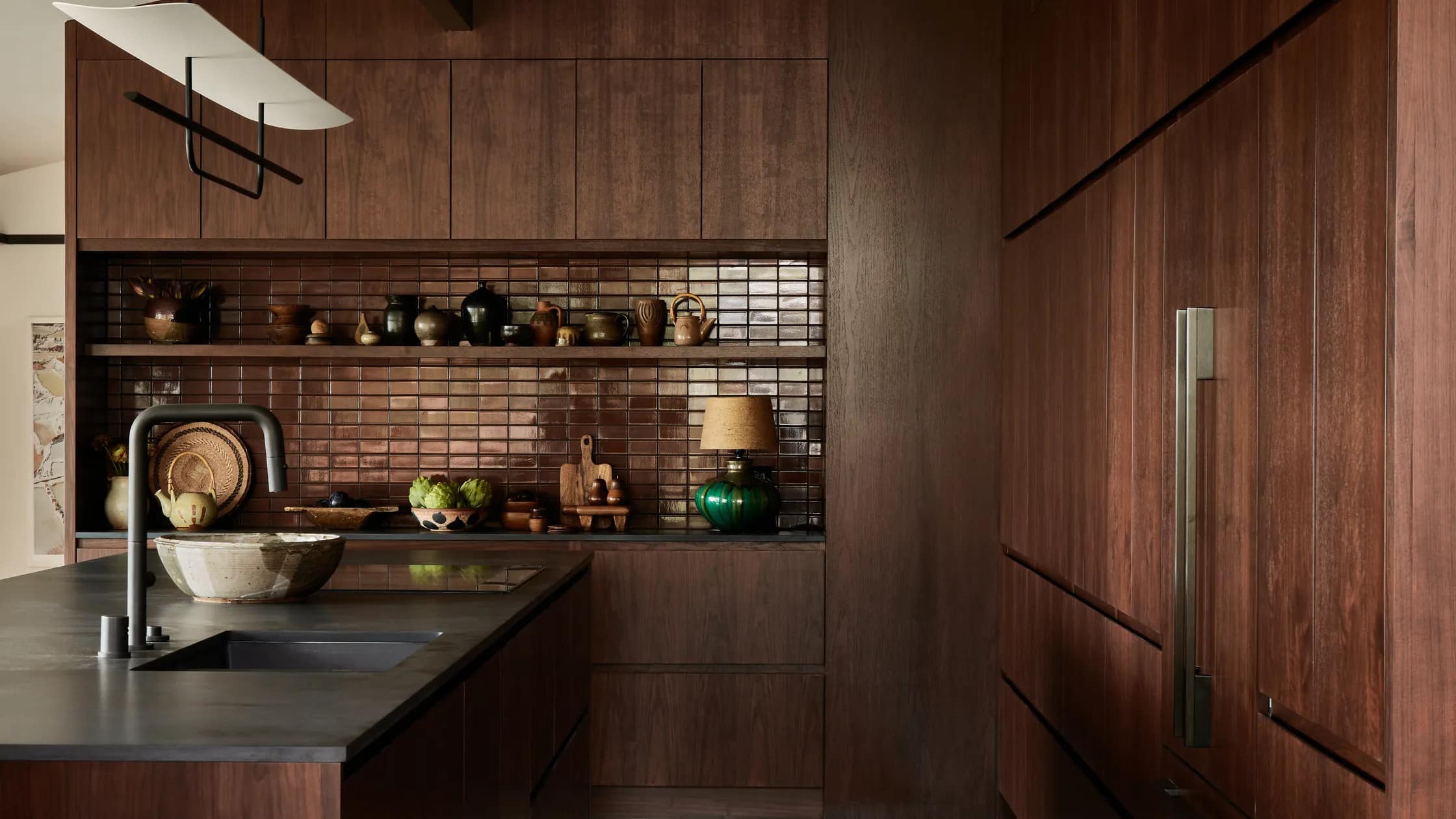
Another fundamental aspect is the inclusion of different textures: integrating materials like velvet, linen, wood, and materials like stone, travertine, and marble enriches the space without needing additional colors. Moreover, the use of patterns and motifs can also enliven the environment, always maintaining visual harmony; opting for geometric, floral, or abstract designs in the same shades as the base color adds interest without disrupting coherence.
Inspiring examples of monochromatic decor
A living room decorated with shades of gray, ranging from pearl to charcoal, creates a modern and refined environment. The addition of soft fabrics and glossy surfaces can enhance the sense of luxury, and in a bedroom, the use of neutral tones like cream, sand, and taupe promotes a relaxing and welcoming atmosphere. The inclusion of natural materials like wood and linen also adds warmth to the space.
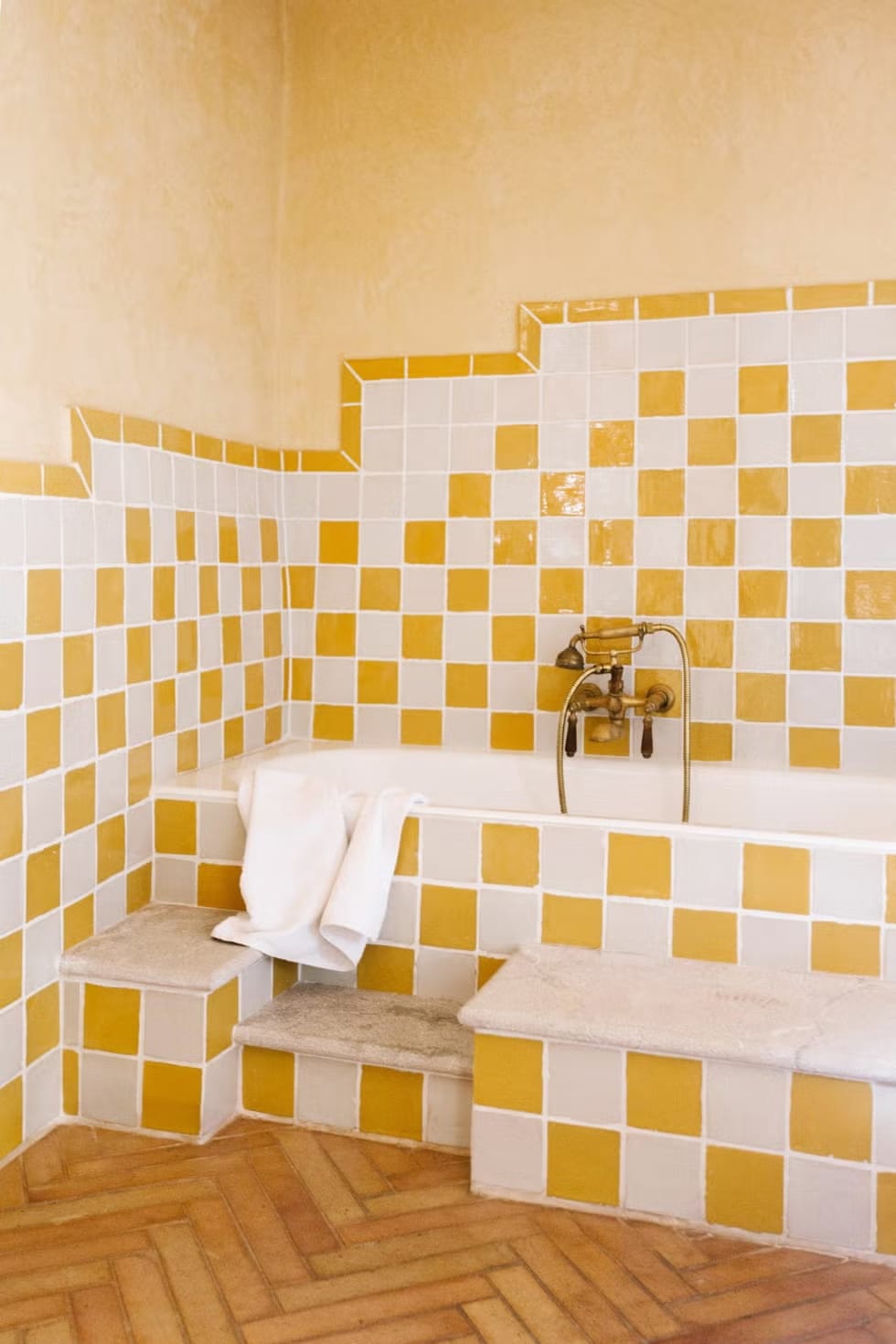
For nature lovers, a reading nook decorated with various shades of green, from olive to moss, can evoke a connection with the outdoor landscape, creating a tranquil retreat within the home. Even in the kitchen, monochromy can be a winning choice: a navy blue palette with light blue and turquoise details can transform the space into a welcoming and sophisticated environment.
Adopting a monochromatic color scheme in decor requires careful planning and sensitivity to shades and textures. However, when executed with care, this approach can transform living spaces into elegant, coherent, and deeply personal environments. The key to success lies in balance: playing with shades, experimenting with materials, and paying attention to details to create a design that is both harmonious and stimulating.
Photo credits: architecturaldigest.com /housebeautiful.com