BLOG
Colors Inspired by Food – The Trend for “Tasty” Interiors
There is a new trend captivating interior designers, creatives on TikTok, and home enthusiasts in general: the aesthetic of food-inspired colors. We’re not just talking about cream-colored walls or “butter and sage” kitchens, but a true way of conceiving space through shades that evoke flavors, textures, and memories. In an increasingly digital and uncertain world, bringing familiar, tangible, and “edible” sensations into the home seems to have become a form of daily well-being.
But what does it really mean to decorate with “food” colors?
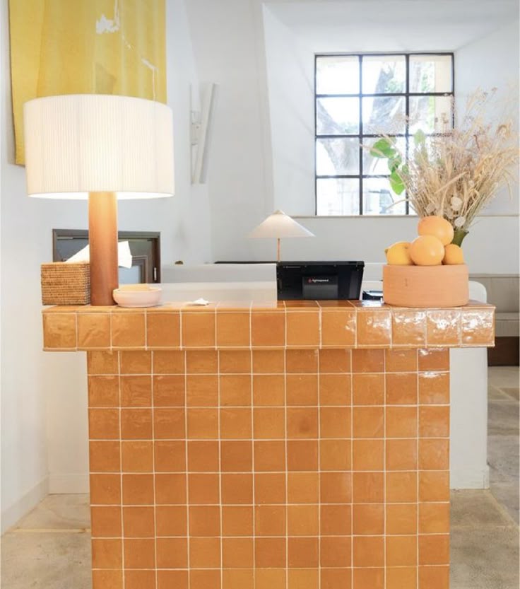
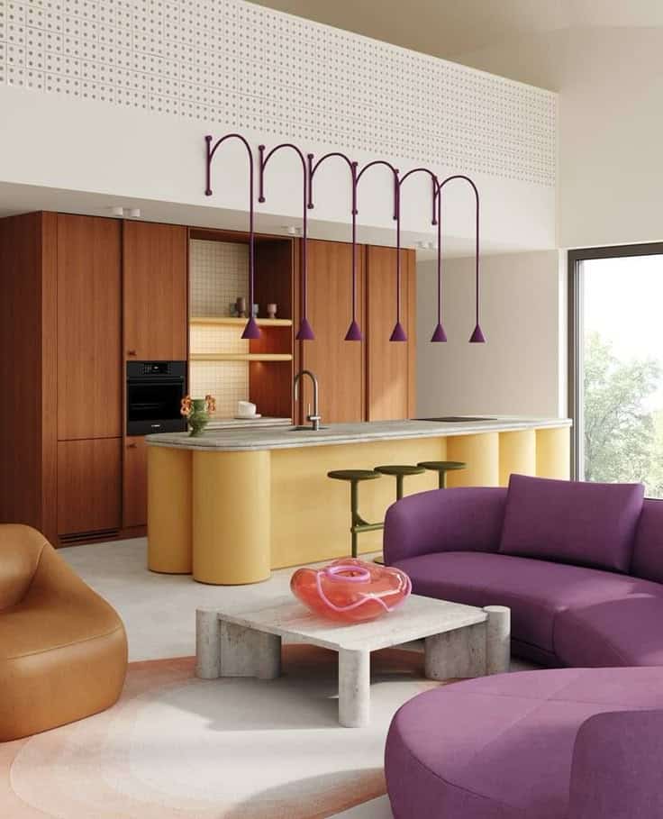
It’s not about decorating with fruit prints or dessert-shaped accessories, but about using color palettes inspired by food in a refined and sophisticated way. Think pistachio green, dark chocolate brown, zabaglione yellow, paprika red, or smoked salmon pink: warm, earthy, or velvety tones that speak to us of ingredients, spices, and recipes, but above all of emotions linked to conviviality and care.
Why now?
According to experts, this trend is a response to a growing need for intimacy and connection: after years dominated by cold minimalism and neutral palettes, today we seek colors that make us “feel” something… security, warmth, pleasure. These colors evoke the idea of comfort food for the eyes — reassuring, familiar, but never dull. And let’s face it: they’re simply beautiful to live with, day after day.
Where and how to use these colors
- in the kitchen, with cabinets in cream or mustard inspired by sesame seeds or mustard;
- in the living room, with olive green walls, cinnamon-colored armchairs, and cocoa rugs;
- in the bathroom, where blueberry, coconut, or mint shades combine with natural textures and matte tiles;
- in the bedroom, where shades like peach, milk, or hazelnut create soft and relaxing atmospheres.
An extra touch
In addition to what is indicated, you can play with:
- depth and transparency: soften richer tones (like caramel or butter) with glossy materials like glass, satin steel, or glazed ceramics;
- olfactory and tactile references: accompany a “dark chocolate” living room with spicy candles or velvet and linen fabrics to stimulate multiple senses simultaneously;
- micro-colors: if you’re afraid of getting tired, introduce the trend with small but effective details — a “strawberry and cream” vase, a turmeric-colored throw, a ginger-colored lamp;
- “single-dish” palettes: create tone-on-tone environments inspired by a single food (e.g., shades of peach, from soft pink to dusty orange), as if you were plating a dessert.
To avoid the “pastry shop” effect, play with contrasts and textures: pair raspberry red with stone or brushed metal materials; accompany buttery beige with dark wood and raw linen; match spicy colors with rounded shapes and tactile surfaces.
The result will be a multisensory space, elegant yet never distant.
Another interesting aspect of this trend is its natural seasonal flexibility. In spring, you can shift towards fresh colors like mint, milk and strawberries, light lemon; in autumn, move to chestnut, pumpkin, nutmeg: the result will be a home that changes with you, following the cycles of nature and taste.
Photo credits: chutmonsecret.com / Pinterest