BLOG
Color Forecast 2026: What will Pantone choose?
Predicting colors does not mean guessing the future. It is rather an exercise in cultural archaeology, a work of excavation among signals from the world of design, fashion, technology, and society. Every new palette that emerges does not come from nowhere, but represents the chromatic translation of an era: and this is what Pantone has been doing for years, declaring the color of the year.
Among the sensational pastels that evoke retro optimism, the nostalgic reds and golds, the dark and relaxing tones, and the modern neutrals, color becomes an intention of where we are heading.
For 2026, three key shades emerge that embody this vision: together they outline a sophisticated imagery, combining nature, materiality, and memory, in a balance capable of meeting the needs for calm, grounding, and identity.
Nature filtered through modernity
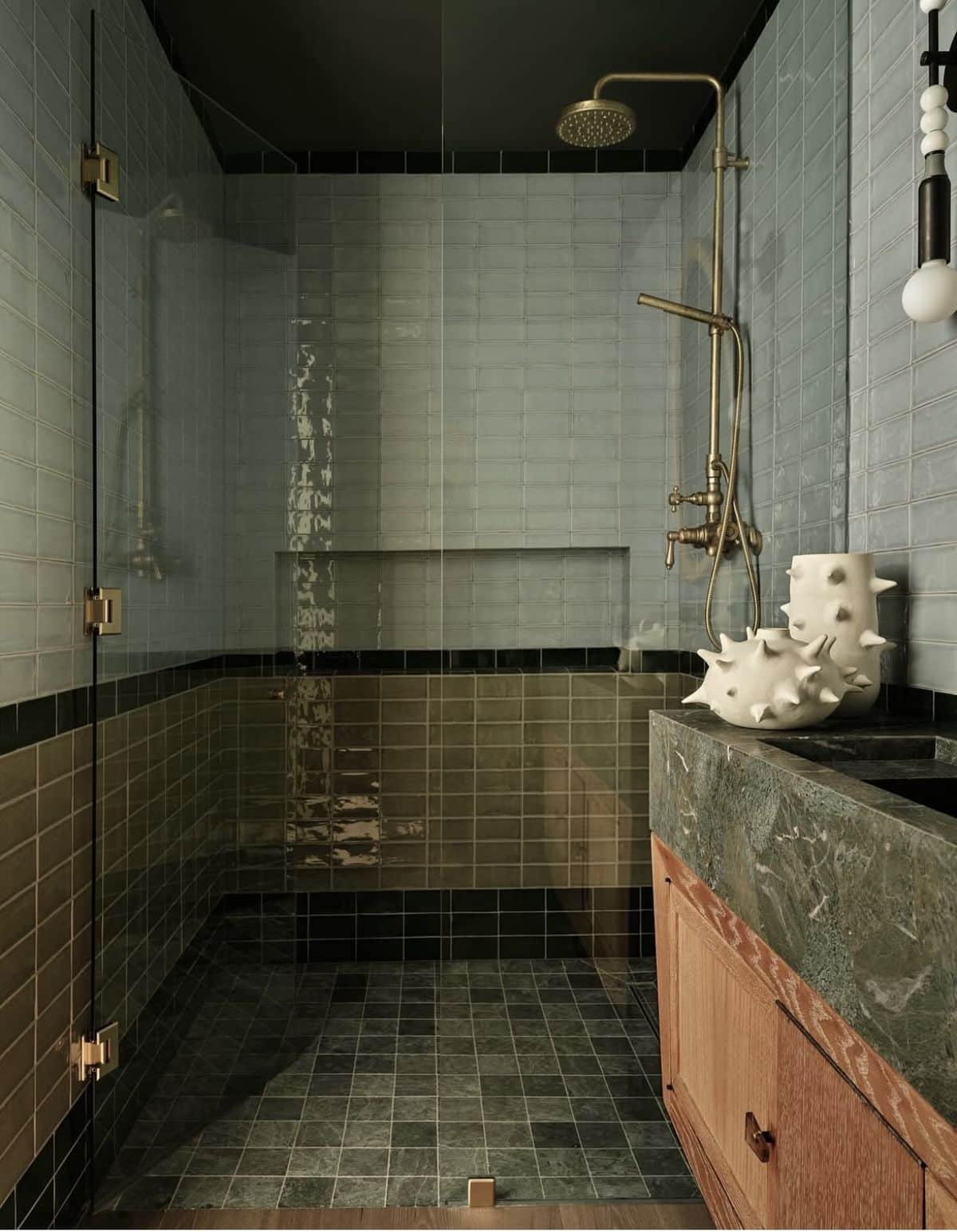
Smoky Jade is not the classic bright green, but a muted shade, wrapped in a slight gray patina, bringing a sense of depth and sophistication, capable of combining the need for contact with nature with the elegance of a contemporary language.
It is positioned midway between jade green and anthracite gray, adapting to spaces seeking calm without sacrificing visual strength; perfect for coverings, textiles, and wall finishes, it lends itself to combinations with natural surfaces such as stone, slate, and light woods.
The return of wood (again)
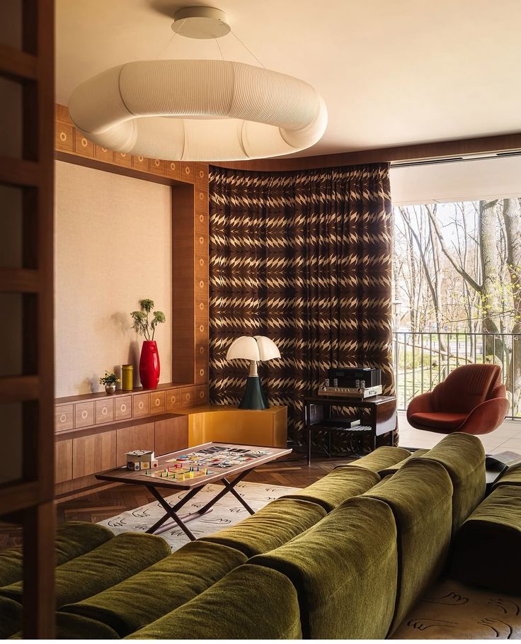
Special Walnut fits into the long rediscovery of wood essences, but with a warmer and more authentic connotation compared to the cool tones that have dominated past years: it is a shade reminiscent of walnut in all its richness, not too dark, not too light, perfectly balanced to convey solidity and elegance.
In the interior design of 2026, this shade becomes the starting point for furniture, paneling, and flooring that convey a sense of timeless comfort. Unlike extreme minimalism that tended to eliminate the superfluous, Special Walnut restores the pleasure of detail, natural grain, and tactility.
Elegance and memory
The third protagonist is Warm Mahogany, an intense reddish-brown that evokes classic furniture, but reinterpreted in a contemporary way. The warm mahogany carries an emotional value: it recalls the memory of inherited furniture, formal dining rooms, ancient libraries, and at the same time, thanks to a new sensitivity for material surfaces, becomes the perfect color to create dramatic contrasts in contemporary spaces.
Paired with satin metals, deep velvets, or minimalist surfaces, it allows for the creation of dense, intimate atmospheres with great character.
A single palette for a complex future
These three colors do not walk isolated from each other, but are part of the same narrative, representing three complementary approaches to the theme of color in interiors.
- Smoky Jade: the need for balance and calm, filtered through a modern aesthetic.
- Special Walnut: the return of natural tactility and welcoming solidity.
- Warm Mahogany: the elegance of memory, reinterpreted for intimate luxury.
Together, they tell the desire for rooting and continuity, but also the willingness to experiment with more expressive languages; no longer “neutral” shades in the sense of anonymous, but hues capable of adding depth and giving identity to spaces.
Photo credits: pinterest /