BLOG
Small house, big mistakes – 5 interior design errors that make spaces appear smaller
When a house appears smaller than it actually is, the problem is rarely the square footage; in most cases, the perception of compressed space stems from a series of poorly calibrated design choices: wrong proportions, absent visual hierarchies, inefficient use of light, furnishings and colors.
This is a recurring theme especially in contemporary urban interiors, where every square meter should work in favor of spatial quality, not against it; analyzing the most common mistakes is useful not to pursue “clever” solutions, but to establish more conscious design, capable of restoring breathing room even to the most contained environments.
A top 5 of interior design errors that make houses appear smaller, with operational guidelines to avoid them
- Distributing furniture along the perimeter without spatial logic
Pushing everything against the walls is one of the most widespread automatisms, often adopted with the idea of “freeing” the center of the room. In reality, this approach flattens the perception of space and makes environments similar to empty containers. Making some elements “float” — a sofa, an armchair, a table — helps create depth, defines functional areas and provides a more articulated reading of the volume. - Underestimating the impact of curtains, rugs and out-of-scale textiles
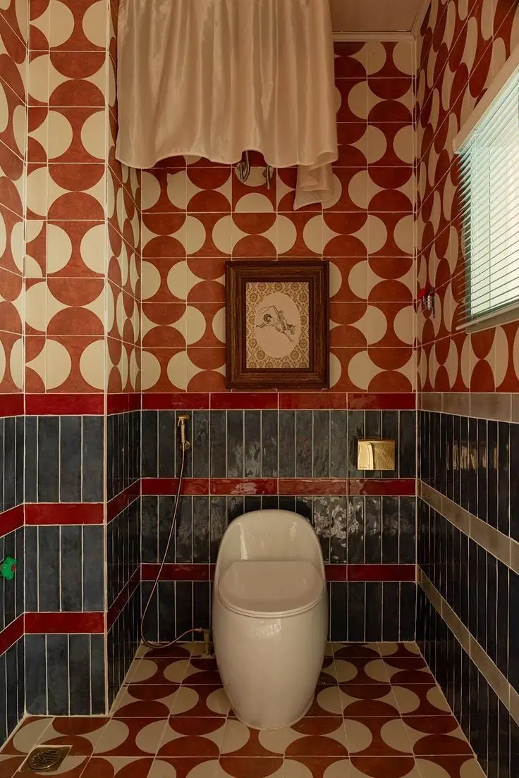
Curtains that are too short, undersized rugs and textiles positioned without a clear relationship to the architecture interrupt vertical and horizontal lines, fragmenting the space. Curtains should follow the height of the room, ideally from ceiling to floor; rugs, instead, must include at least the front legs of the main furnishings; these are apparently secondary details, but decisive in the perception of proportions. - Using color as an element of separation instead of continuity
Overly sharp contrasts between walls, ceilings, fixtures and moldings create a fragmented reading of space, accentuating its physical limits. In small or medium environments, it is often more effective to work with coherent chromatic fields: related colors, tonal variations, finishes that dialogue with each other. This does not mean giving up character, but distributing it strategically, avoiding excessively “framing” the space. - Overloading with too many visual stimuli
An excess of patterns, colors, decorative objects and micro-furnishings generates visual noise and reduces the readability of the environment. Even warm and layered interiors need pauses, free surfaces and clear hierarchies; better few well-chosen elements, with a strong spatial role, rather than a sum of details that compete with each other. Visual density is one of the main factors that make a house feel smaller. - Poor lighting management, especially vertically
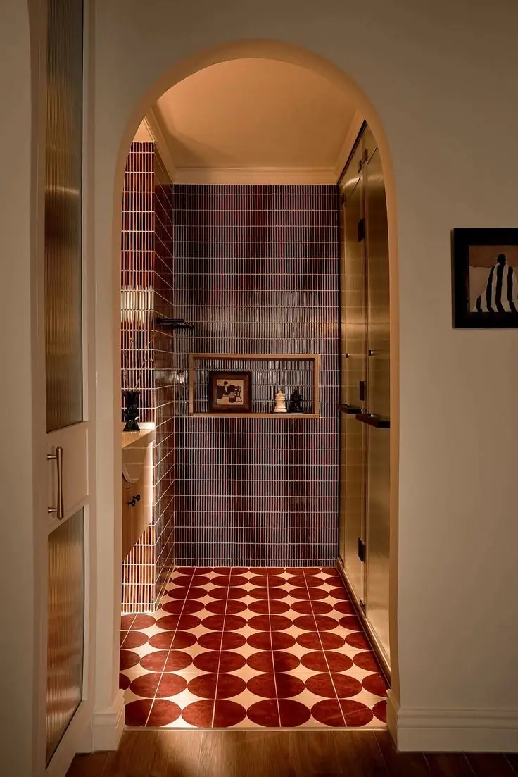
Relying on a single central light source or, conversely, multiplying bulky floor lamps compromises the perception of space; good lighting works on multiple levels: ceiling, walls, functional surfaces: wall sconces, integrated lights and indirect light points free up floor space and amplify the sensation of height and depth; the position of lighting fixtures also matters: fixtures that are too low or oversized visually compress the environment.
Beyond individual errors, the central theme remains one: designing by thinking of space as a system, not as a sum of objects. The houses that work best — regardless of square footage — are those in which furnishings, colors, materials and light collaborate to build a coherent narrative; avoiding these five errors does not mean making interiors anonymous or minimalist, but more readable, balanced and capable of breathing.
Photo credits: Pinterest